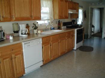
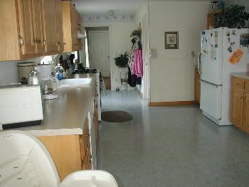
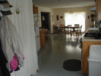
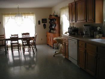
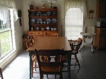
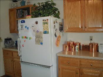
As some of you know I decided to repaint my kitchen a couple of weeks ago.
I had thought I would paint it a color named "Red Gumball". It was a pretty shade of red. But in spite of some of you voting for the red, I decided against it. Mainly because I have several full walls and I was afraid it would be too overbearing. If I had a smaller galley type kitchen broken up by cabinets, I think I would have gone for it.
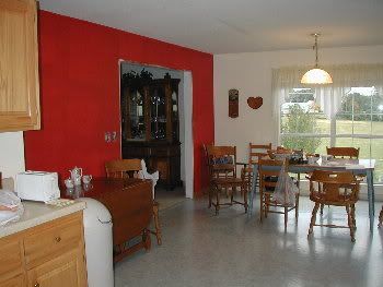
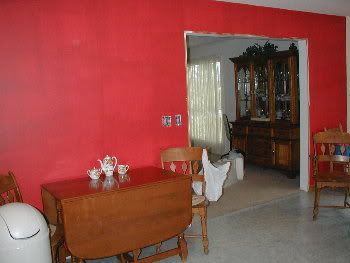
However, I decided to go with Light Sage.
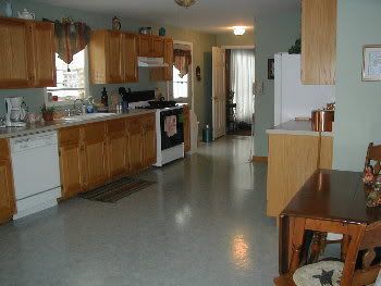
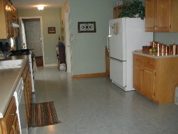
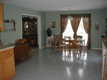
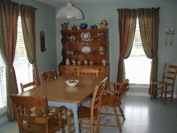
I wasn't sure about the full curtains but I think I'm going to like it and it seems to give the kitchen a warmer feeling. I'm also going to paint the legs of my table the same color as the trim...off white.
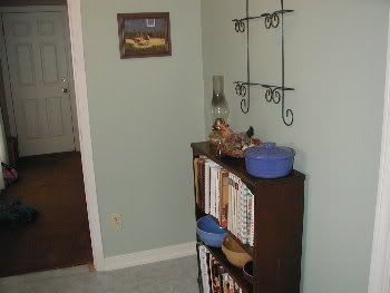
The bookcase was my mothers and a darker wood than most of my furniture. But since I moved these darker framed pictures over here I decided to use the bookcase and store my cookbooks in it as well as display some of my crock bowls.
I had purchased the plate rack several months ago for another project but ended up buying a different style for that. So I decided to use the other one here, so now I have to buy some plates to display in it.
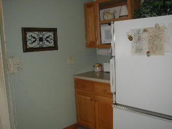
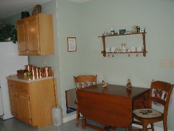
We do still have a few things left to do, like painting some more trim, hanging the blind over the sink, etc.
Movin' on to the next room!!!
5 comments:
Wow, the sage did turn out pretty! The red would have been too over powering!
I like that Onto the next room...!
Wonderful job.
It looks beautiful!
Wow, Cheryl. I liked the red, it was so striking. But this is gorgeous. This is the kind of color scheme I happen to love. What a pain it must have been to paint over the red but my goodness, it was worth it!
I've sent you two emails now. And I'm not sure you got them. Can you let me know. They were regarding trying to help you get your sidebar spaced and centered the way you want. I'm really not sure you got my emails.
I absolutely LOVE the light sage! How gorgeous! Man, I really need you to hang out and motivate me more. You've done GREAT!
LOVE it!! I voted for the red, but this seems to work much better with the "surroundings", furniture, etc. Beautiful!! I also love the long curtains - never thought of that, but it works! Awesome job......please let me know when you do more so I can check it out.
Post a Comment